Understanding Cover Letter Fonts
In the competitive world of job applications, every detail matters. Your cover letter is your first impression, and while content is king, the font you choose plays a significant role in how your application is perceived. The font you select can influence the readability, professionalism, and overall impression your cover letter makes on a potential employer. Selecting the right font is a subtle yet powerful way to ensure your application stands out for the right reasons. A well-chosen font enhances readability and reflects attention to detail, both crucial for making a positive impression and getting your resume noticed. The correct font will help you to be taken seriously and to show that you care about your application.
Why Font Choice Matters
The font you use in your cover letter is more than just a stylistic choice. It directly impacts how easily a hiring manager can read and understand your application. A poorly chosen font can strain the reader’s eyes, making it difficult to absorb the information and potentially leading them to skim or even disregard your letter altogether. Conversely, a well-chosen font improves readability, making your qualifications and experience more accessible and engaging. The right font reinforces your professionalism, showing that you care about presenting yourself and your skills in the best possible light, thereby improving your chances of landing an interview and getting the job you desire. Choosing the right font is vital.
Impact on Readability and Impression
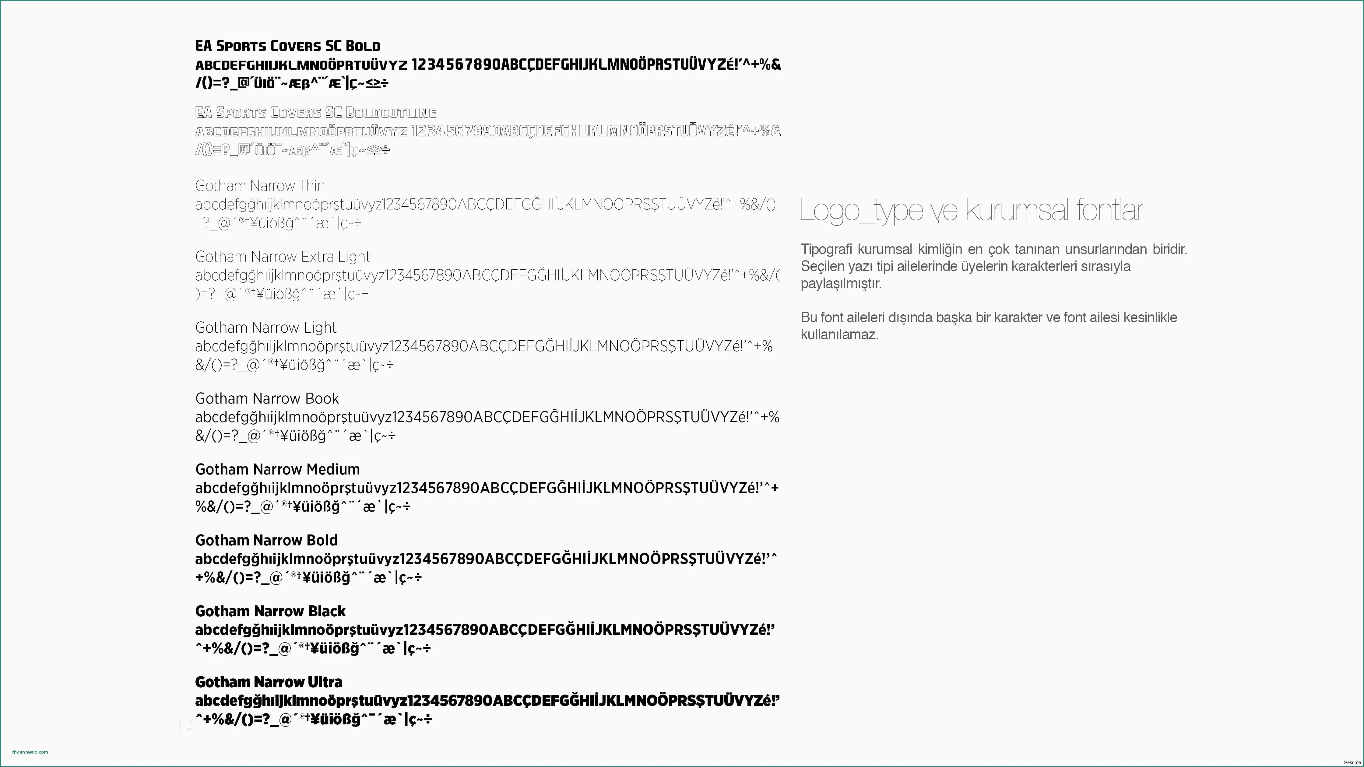
Readability is key to the success of your cover letter. The font you select determines how easily the hiring manager can read and understand the text. A font that is too small, too stylized, or too cluttered can be difficult to read, potentially causing the reader to lose interest or misunderstand the information. Conversely, a clear, legible font makes the cover letter easy to read, allowing the hiring manager to focus on your qualifications and experience. Moreover, your font choice significantly impacts the overall impression you make. A professional and appropriate font communicates attention to detail, thoughtfulness, and respect for the reader’s time. This can set you apart from other applicants and increase your chances of success, leaving a positive and lasting impact on the hiring manager.
7 Fonts to Impress on Your Cover Letter
Selecting the right font for your cover letter is essential to make a positive impression. Here are seven fonts known to project professionalism and enhance readability, increasing your chances of success:
1. Arial
Arial is a widely used sans-serif font known for its clean and modern appearance. Its straightforward design makes it highly readable on screens and in print, making it a good choice for cover letters where clarity is paramount. Arial’s simplicity is also a strength, as it doesn’t distract from the content of your cover letter. This is a good option because it’s a safe, reliable choice that can be very effective.
Pros and Cons of Arial
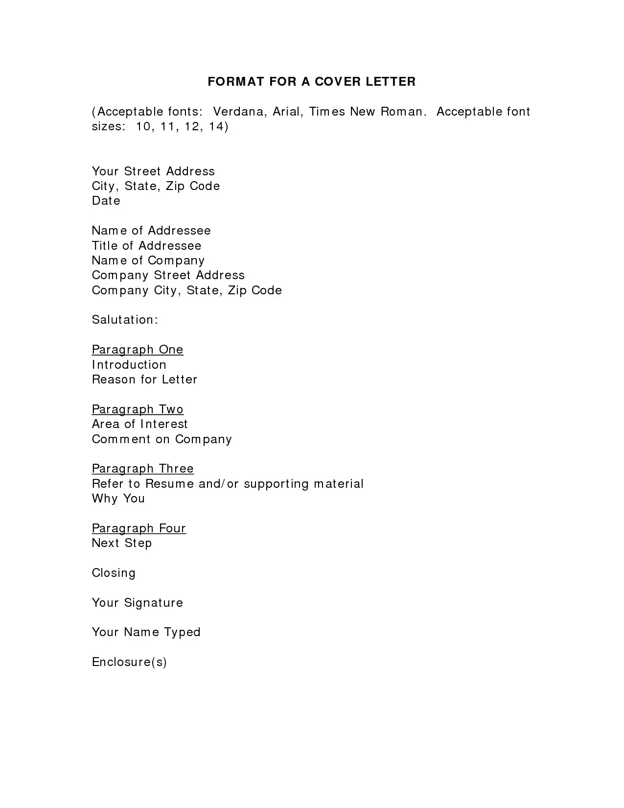
Pros include Arial’s excellent readability and universal availability across different operating systems and devices. Its clean appearance gives a modern feel and is appropriate for many industries. Cons include that, because it is so commonly used, it may not help you stand out. Some may view it as slightly generic. The best choice here depends on the specific industry.
2. Times New Roman
Times New Roman is a classic serif font that conveys a sense of formality and tradition. Its elegant design is a good choice for more conservative industries, where a sense of professionalism is important. It’s also a reliable choice. Because of its classic nature, this is a safe bet to make when choosing your font.
Pros and Cons of Times New Roman
Pros include its classic, professional appearance and excellent readability in print. It is widely recognized and available. Cons include that Times New Roman can appear dated in some contexts, and it may not be the best choice for modern or creative industries. Overuse can also make it seem unoriginal.
3. Calibri
Calibri is a sans-serif font that is often used in Microsoft Office applications, making it a readily available and familiar choice. Its clean lines and open design make it easy to read on screen, which is advantageous when cover letters are often viewed digitally. Calibri projects a modern and friendly image, making it a good choice for many professional environments.
Pros and Cons of Calibri
Pros are its excellent on-screen readability, its modern aesthetic, and its widespread availability. Cons can be its ubiquity, as it may not stand out. In some cases, it can be perceived as too informal for highly traditional settings. This makes the choice slightly less obvious, and is a good point to consider.
4. Helvetica
Helvetica is another sans-serif font, known for its clarity and neutrality. Its simple, clean design gives a modern and professional appearance that is suitable for a wide range of industries. Helvetica’s universal appeal makes it a safe and dependable choice for your cover letter, ensuring that your message is communicated clearly and effectively.
Pros and Cons of Helvetica
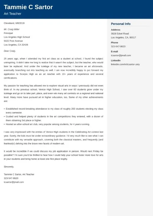
Pros include its excellent readability and clean, professional appearance. It is versatile and well-suited for many applications. Cons are that, similar to Arial, Helvetica’s widespread use might make it less distinctive. Its neutrality may also not be the best choice for creative roles. This is not an easy decision to make.
5. Garamond
Garamond is a serif font known for its elegance and sophistication. Its classic design is an excellent choice for cover letters where you want to convey a sense of prestige and attention to detail. Garamond’s readability, even in smaller sizes, makes it a good choice for a polished and refined presentation.
Pros and Cons of Garamond
Pros are its elegant and sophisticated appearance, and its readability at smaller sizes. Cons are that it might not be appropriate for all industries, and some may find it too formal. Additionally, it may be slightly less common than other fonts.
6. Georgia
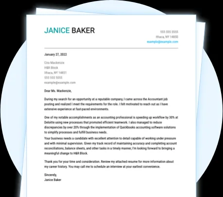
Georgia is another serif font designed specifically for screen readability. Its robust design and clear letterforms make it very easy to read, both on paper and on a screen. This font is a great choice for cover letters, especially if you anticipate that they may be viewed digitally. Georgia strikes a balance between professionalism and approachability, making it a versatile option for a variety of industries.
Pros and Cons of Georgia
Pros include excellent readability on screen, a balance between professionalism and approachability, and its versatility. Cons are that it might be perceived as slightly less formal than Times New Roman or Garamond. This is not always the best choice, depending on the situation.
7. Trebuchet MS
Trebuchet MS is a sans-serif font with a clean and modern appearance, similar to Arial and Helvetica. Its simple design offers great readability, making it an excellent option for those who want to ensure their cover letter is easy to read. Trebuchet MS is known for its clear, open letterforms, which provide a friendly and accessible look, suitable for a range of professions.
Pros and Cons of Trebuchet MS
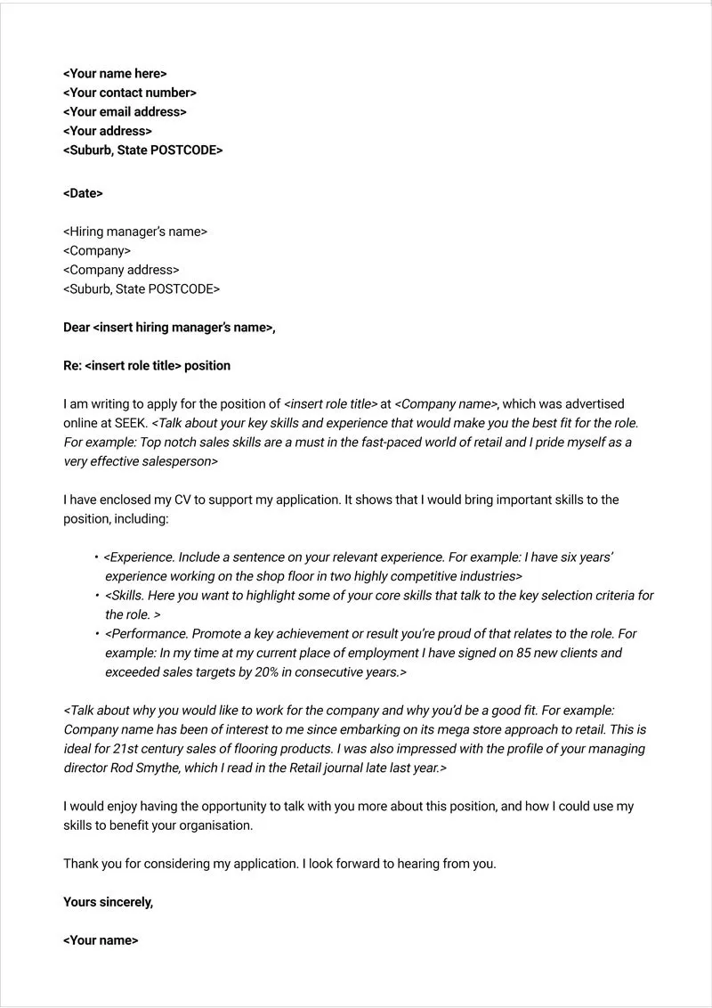
Pros include its modern and clean appearance, making it easy to read. Cons are that, like other sans-serif fonts, it might not be suitable for every industry or role, and may appear less formal than serif fonts. Therefore, consider these points while making your choice.
Tips for Choosing the Right Font
Choosing the right font for your cover letter depends on your individual circumstances and the specific job you’re applying for. Consider the following factors to make the best choice:
Consider the Industry
The industry you’re applying to can influence the best font choice. For example, traditional industries like finance and law might favor more conservative serif fonts such as Times New Roman or Garamond. Conversely, creative or tech industries might prefer sans-serif fonts like Arial, Helvetica, or Calibri. Research the company culture and the style of others in your field for a better indication of the appropriate choice.
Font Size and Spacing
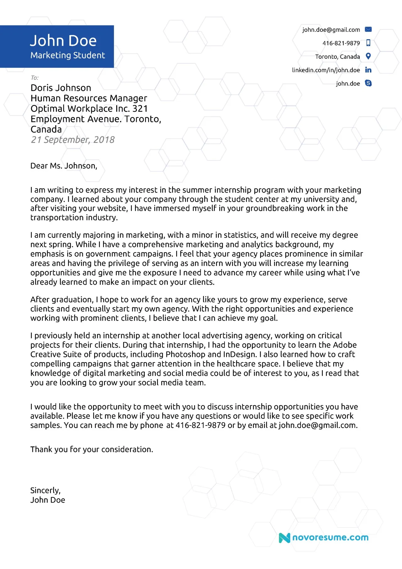
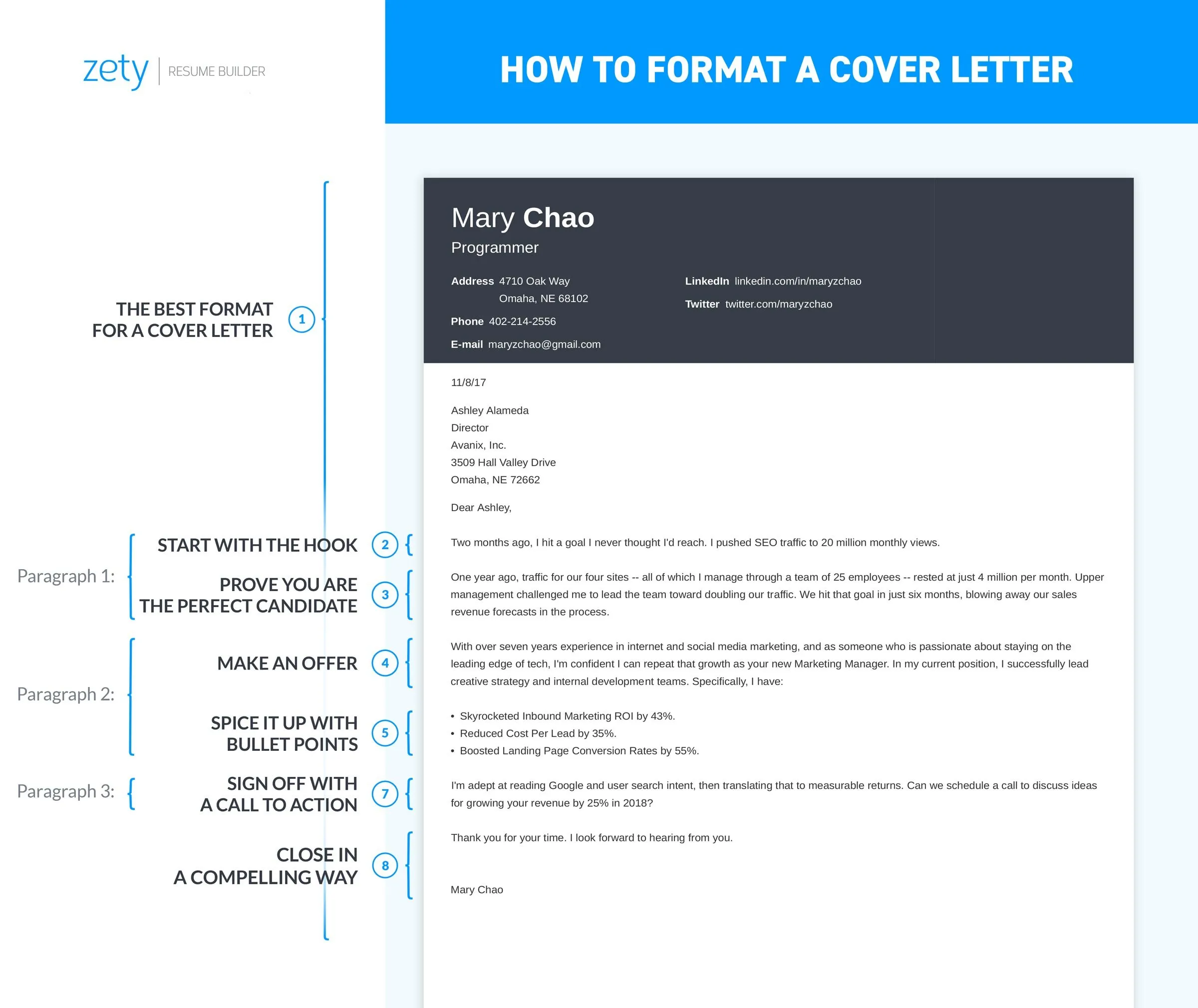
Font size and spacing also play a significant role in readability. Generally, use a font size between 10 and 12 points. Ensure that the spacing between lines (typically single or 1.15) is ample enough for easy reading. Poor sizing or spacing can make your cover letter difficult to read, regardless of the font selected. These are all important factors when choosing your font, and will help to make a good impression.
Testing Your Cover Letter Font
Before sending your cover letter, test it to ensure readability. Print your cover letter to evaluate how it looks in physical form. Ask a friend to review it and give feedback on its readability. Different screens and printers may render fonts differently. Make sure that the font renders well across different devices and mediums before finalizing your document. Thorough testing will help you to refine the font choice.
