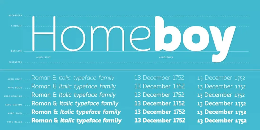
Why Font Choice Matters for Your Resume
Your resume is your first impression, and every detail contributes to how a potential employer perceives you. While content is king, the font you choose plays a critical, yet often overlooked, role in shaping that impression. The right font enhances readability, projects professionalism, and reflects your attention to detail. Conversely, a poorly chosen font can make your resume appear unprofessional, difficult to read, and even signal a lack of care. In a competitive job market, where recruiters often spend only a few seconds initially scanning a resume, maximizing readability and visual appeal is essential. A well-chosen font ensures that your key qualifications are easily and quickly absorbed, increasing the likelihood that your resume will make it to the next stage of consideration. Think of your resume font as the silent ambassador of your abilities, making sure your skills and experience are presented in the best possible light.
Impact of Fonts
Fonts aren’t just about aesthetics; they communicate subtle messages. Serif fonts, like Times New Roman and Garamond, have small decorative strokes (serifs) at the ends of letters, often conveying a sense of tradition and trustworthiness. They can enhance readability in printed documents. Sans-serif fonts, like Arial and Helvetica, lack these strokes, presenting a cleaner, more modern look, which is often preferred for digital viewing. The choice between serif and sans-serif depends on the image you want to project. Moreover, the font’s weight (bold, regular, light) and style (italic) influence how the text appears. Bold fonts draw attention to key information, while italics can emphasize specific points. The font’s size and spacing are also crucial, affecting the visual balance and readability of your resume. A font that is too small or too closely spaced can make your resume seem cluttered and difficult to read. The font’s overall impact contributes to the immediate impression a recruiter forms when they first see your resume.
Readability and Its Importance
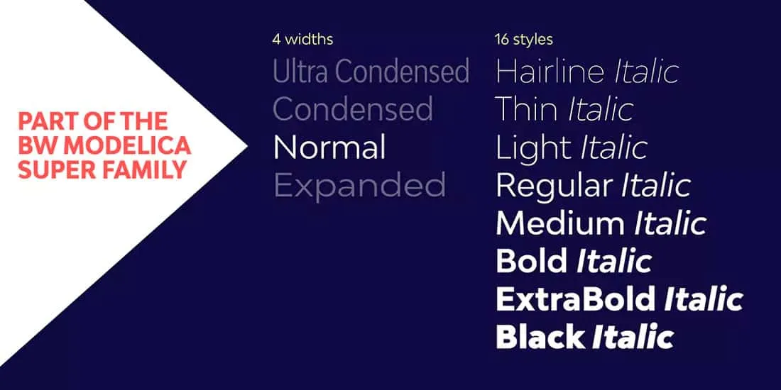
Readability is paramount. A font that is easy on the eyes allows the reader to quickly grasp the content without straining. This is especially important because recruiters often review hundreds of resumes, and a difficult-to-read resume is quickly discarded. Factors such as the font’s letter shape, spacing, and overall design contribute to readability. Fonts with clear, distinct letterforms, consistent spacing between letters and words, and sufficient line height are easier to read. Avoid overly ornate or stylized fonts that may look interesting but hinder comprehension. A readable font makes your resume accessible, ensuring that your skills and experiences are clearly communicated. Prioritizing readability is a strategic way to ensure that your resume stands out for the right reasons, making it easier for potential employers to see your qualifications.
Font Size and Spacing Considerations
Font size and spacing are crucial aspects of readability. Generally, a font size between 10 and 12 points is ideal for resumes. This size provides a balance between readability and the ability to include enough content on a single page. The size should be large enough to be easily read without requiring the reader to squint. However, a font that’s too large can make your resume look unprofessional and take up too much space. Line spacing should be set to 1.15 or 1.5 to provide adequate space between lines of text, preventing the text from appearing cluttered and making it easier to scan. Proper spacing also applies to paragraphs and headings, which should be clearly distinguished from each other. Careful attention to font size and spacing is essential for ensuring that your resume is not only readable but also visually appealing and well-organized.
Top 7 Fonts for Your Resume
Here are some of the best font choices for your resume, each offering a unique blend of style and readability, tailored to make a strong first impression.
Arial The Classic Choice
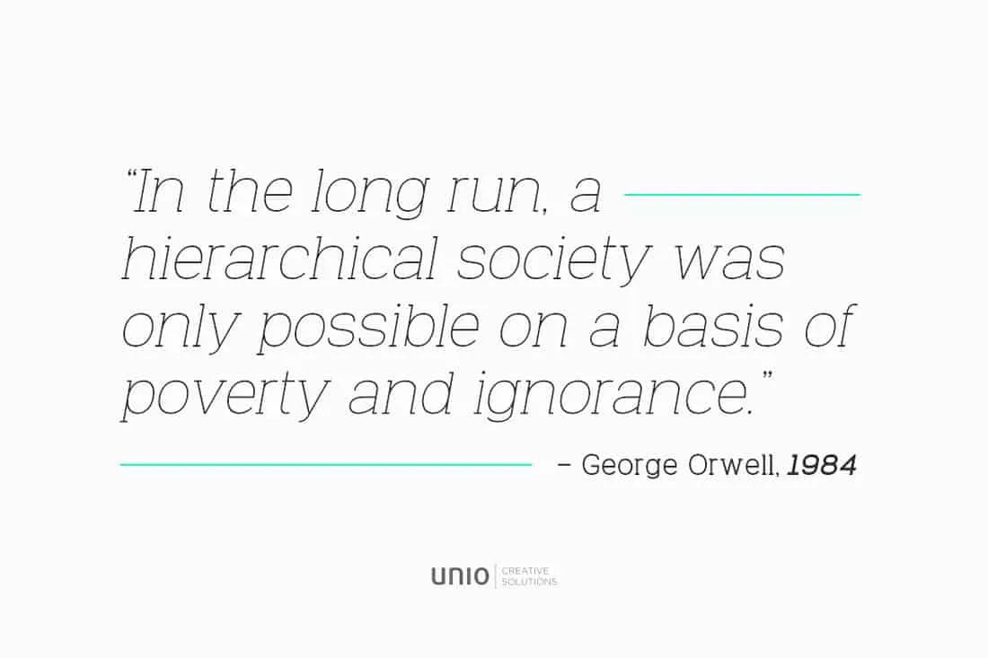
Arial is a widely recognized sans-serif font known for its clarity and simplicity. It’s a safe, versatile choice that projects professionalism without being overly formal.
Advantages of Arial
Arial’s clean lines and open letterforms make it highly readable on both screen and paper. Its familiarity means that it is easily understood by all audiences. Arial is a universally compatible font, so you can rest assured that your resume will look the same regardless of the recipient’s system.
When to Use Arial
Arial is a suitable option for most professional environments. It’s particularly effective for industries where a modern, straightforward approach is valued. Avoid using Arial if you want your resume to have a unique look. Consider using this font if you want a clean look.
Times New Roman A Timeless Option
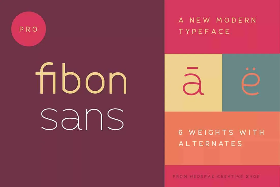
Times New Roman is a classic serif font that conveys a sense of tradition and reliability. It is a good choice for those wanting a traditional, professional look.
Benefits of Times New Roman
Times New Roman’s serifs enhance readability, making it easier for the eye to follow lines of text, especially in longer documents. Its widespread use gives it a sense of authority and trustworthiness. It is a font that is universally available on most systems.
Best Use Cases for Times New Roman
Times New Roman is well-suited for professions where a conservative, traditional approach is valued, such as law, finance, or academia. It might not be the best choice if you want to project a cutting-edge, modern image.
Helvetica The Modern Standard
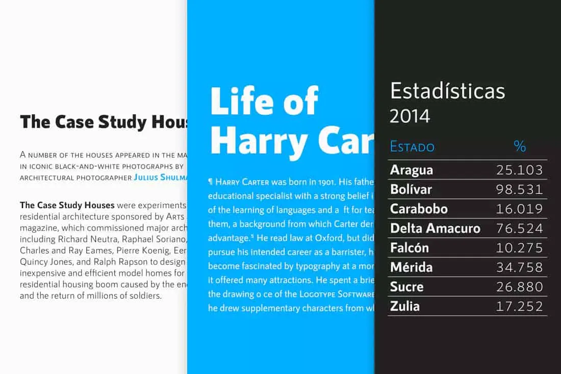
Helvetica is a widely used sans-serif font, known for its clean lines and neutrality. It projects a modern, professional image.
Helvetica’s Features
Helvetica’s clarity makes it very readable, and its simple design ensures that the focus remains on your content. Its neutrality means it works well across various professional settings.
Ideal Situations for Helvetica
Helvetica is an excellent choice for industries that value a modern aesthetic, such as technology, design, and marketing. It’s a versatile font that works well in most professional contexts.
Calibri A Popular Font
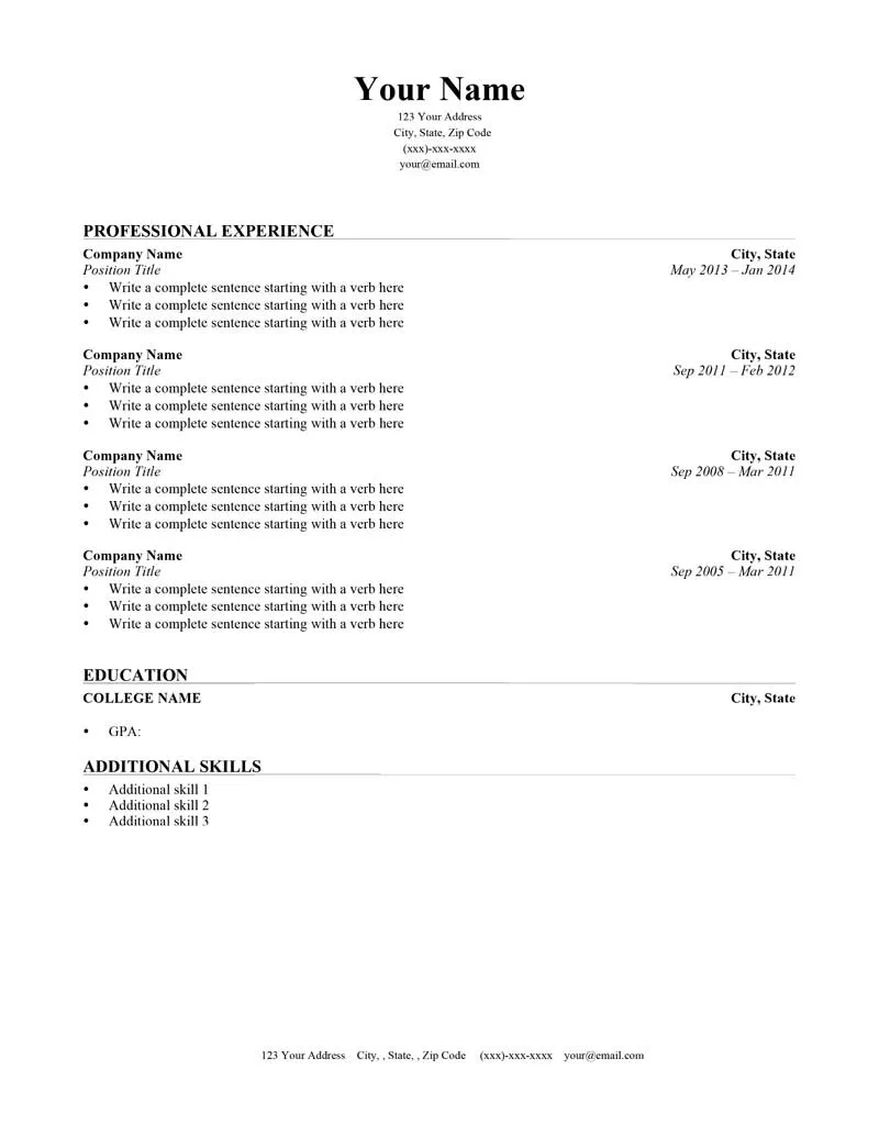
Calibri is a sans-serif font that has become a default in many applications, making it readily available and easily recognizable.
Calibri’s Characteristics
Calibri is known for its soft, rounded appearance, which gives it a friendly, approachable feel. It is designed for optimal readability on screen and in print. It’s a good choice for those who want a modern feel.
Appropriate Uses of Calibri
Calibri is suitable for most professional environments and is a good default choice if you’re unsure. Its widespread use means it’s a safe and reliable option.
Garamond An Elegant Choice
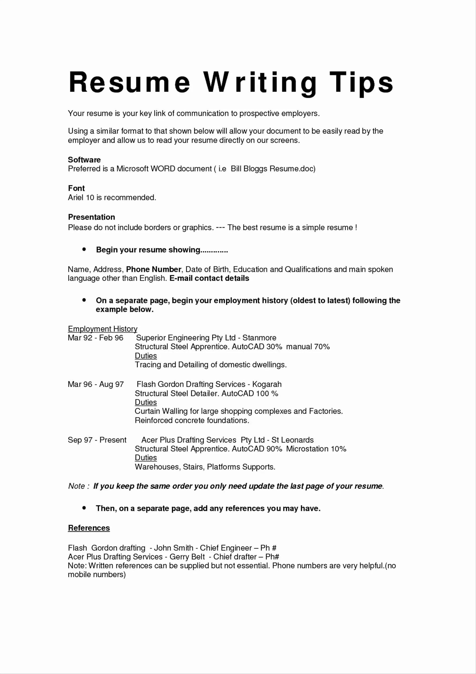
Garamond is a serif font that exudes elegance and sophistication. It has a classic appeal with a touch of refinement.
Garamond’s Appeal
Garamond’s graceful letterforms and subtle serifs enhance readability. It is a classic font that adds a touch of personality without overwhelming the content.
Best Scenarios for Garamond
Garamond is suitable for industries where a polished and refined image is valued, such as art, design, and luxury goods. It is a good option for those who want to project a touch of sophistication.
Cambria A Professional Font
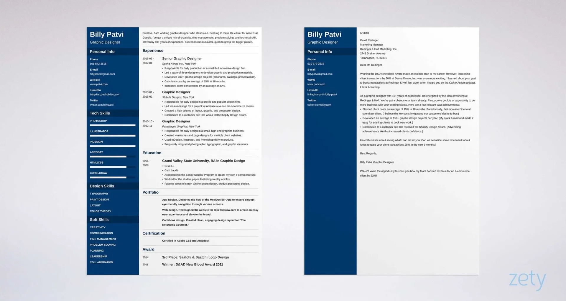
Cambria is a modern serif font designed for on-screen reading. It provides excellent readability.
Cambria’s Suitability
Cambria’s clear letterforms and optimized spacing make it very readable. It’s a versatile font that works well in both printed and digital formats.
Situations Where Cambria Shines
Cambria is a great choice for any industry. It’s a professional font.
Choosing the Right Font for Your Cover Letter
The font choice for your cover letter should complement your resume and reflect your professionalism. Consistency between your resume and cover letter is essential to maintaining a cohesive brand. While the content and tone of your cover letter are crucial, the font also plays a vital role in the overall impression you make.
Cover Letter Font Guidelines
When selecting a font for your cover letter, consider the same principles as with your resume: readability and professionalism. Choose a font that is easy to read and reflects the tone and style of your writing. Avoid overly ornate fonts that might distract the reader. Stick to the font families you used for your resume. Select the font that matches the industry you are applying to.
Consistency Across Documents
Using the same font for both your resume and cover letter creates a professional and consistent brand. This consistency demonstrates attention to detail and reinforces your overall presentation. If you choose Arial for your resume, using Arial for your cover letter will create a harmonious and easily readable package. If you choose Times New Roman, ensure that both your resume and cover letter use Times New Roman. It is very important to select the correct font and stay consistent throughout.
Font Size for Cover Letters
As with your resume, a font size between 10 and 12 points is recommended for your cover letter. The font size should be large enough to read comfortably without appearing oversized. Ensure your text is clear and easy to scan. A slightly larger font size might be appropriate for a cover letter to ensure the reader can see what you have written.
Final Thoughts on Resume Fonts
Choosing the right font is a critical step in creating a resume that captures attention and effectively communicates your qualifications. Readability, professionalism, and consistency are the cornerstones of a successful font choice. By selecting a font that reflects your personal brand and professional goals, you can ensure that your resume stands out for the right reasons, increasing your chances of landing your dream job. Take your time and consider the best font for your resume and cover letter.
